Monday, June 7, 2010

In yesterday's NY Times Sunday magazine there was an intriguing article discussing an art theft blog - did you see it? It's run by a fellow who goes by the name Turbo Paul. As Virginia Heffernan reports, he is "a self-described former dealer in stolen antiques" but now is on the other side, digging and blogging to track down and help recover stolen art.

One of his blogs, Stolen Vermeer, is devoted exclusively to reporting on the two decades-old investigation into the recovery of works stolen in 1990 from Boston's Isabella Stewart Gardner Museum. The other blog, Art Hostage, tracks a number of art thefts worldwide.

This passage from Heffernan's article provides a feel for the insider nature of Turbo Paul's blogging:

. . . Turbo Paul knows everything about cops and robbers -- or seems to. Sure enough, by May 22, he was proposing what the Paris heist (of May 20th) meant; who was sending signals to whom; who was humiliated by the heist and who had the last laugh. He said his blog was besieged by visitors with prestigious IP addresses, and when I asked, he passed on the routing information of his readers: Justice Department, State Department and F.B.I." (p. 20)

It dawned on me that maybe we should hire this guy to start looking for Osama Bin Laden. . .or figure out how Lance Armstrong is getting away with doping, or exactly what happened with the Gores.

Above left is one of the stolen paintings, Woman with a Fan (1919) by Modigliani. (I was not familiar with that painting; the shapes seem to work together so well, with the rectangle in the top left balancing beautifully against the shape of her ear and the tip of the fan.) I think you will find these blogs pretty entertaining. No attempt to be politic, circumspect, or balanced. Refreshing.

Just noticed that in today's NY Times (C1) there is a review of the memoir Priceless: How I went Undercover to Rescue the World's Stolen Treasures. The author, former FBI agent Robert K. Wittman, features prominently in Turbo Paul's blog posts, since he's the undercover agent who was hot on the trail of the works stolen from the Isabella Stewart Gardner Museum. Read the review here.

Thursday, June 3, 2010

Just finished reading an interesting blog post from May 31st about Sargent's Daughters of Edward Boit at this link (Alchemist's Pillow) so I've been thinking about how difficult it is to capture a likeness, especially with just a few strokes. This is Two Women by Iraqi painter Faik Hassan.

Others have pointed to Bonnard and Picasso as artistic influences (see Art, edited by Robert Benton, p. 273), and that makes sense to me, but what I am amazed by is the ability to nail down these portraits with a few tones and a few swipes of paint. I've been struggling this morning with a face for a commission, wiping it off, starting over again, and so on, and then I open this book and see these two.

Well, he did win a scholarship to go to Paris during the 30s and study at the École des Beaux Arts. (That little piece is missing from my backgound, alas.) Upon his return to Iraq, he established and led the painting and sculpture department of the Institute of Fine Art. In addition to landscapes and portraiture, Hassan also created a large mural in Tiran Square as one of a number of projects he worked on to serve his country. He died in 1992.

Here's one I like from the Dijla Gallery.

Unfortunately, the title is not posted, but it is oil on canvas. Monochromatic scheme works for me, and besides, I've always liked nun paintings. Time for a shrink?


Monday, May 31, 2010


I'm just not clever enough to tie in Memorial Day with some work with war imagery.

Even though I've lived in Washington state for a total of almost 13 years, I feel as though I barely know the names of the leading artists here, many of whom are still alive and painting. While thumbing through a book on NW painters I came across George Johanson. Apparently, when his left Seattle he was only 17. He came to the Portland Museum Art School from Seattle in 1946 on an art scholarship awarded by Scholastic Magazine. Aside from trips to Paris, Mexico and time spent studying in New York, he never really left, teaching for 25 years at the Museum Art School and developing a career in painting and printmaking.

I've never really gotten too excited about Surrealism, so when I read that he felt drawn to it, I thought, hmmmm, oh well. But look at this above- isn't it colorful and interesting? (The seam down the middle is from the book's spine.) I really like the st
rong use of negative space, the bent perspective, the repeated curves, unexpected colors. What do you think?

Here are two more and they seem to be coming more from an abstract expressionist interest, don't they? This is Western Exposure:

Trying to identify just what it is that I like about these. Maybe the combination of very small and very large, strong simple shapes, maybe the foreground figures that are just suggested.

This is Mirror Window. Below it is one that's from a gallery exhibition this year, called Nude with Mirror. (Here's a link to the Mark Woolley Gallery in Portland, as well.) What do you think?

Thursday, May 27, 2010


I've always liked the chalkboard-like paintings of Cy Twombly without really understanding what it was that drew me in.

In a book that does an interesting job of choosing writers to talk about artists, Philip Hensor (The Spectator and other British newspapers) discusses Twombly's work and offers his view that "obliteration is always intimately connected with writing in Twombly. . ." (p. 137, Writers on Artists, DK Publishing, 2001)

The writing is "on the teasing edge of legibility; but falling off that edge, rather than clinging on. . . They are not the writing of a teacher communicating with his class. . . to borrow a phrase from Barthes, the degree zero of his paintings, which wipe out meaning like a classroom duster, which obliterate writing s
o thoroughly while evoking it. . ."(p. 137)

I think I agree with Hensor that Twombly's paintings are more powerful when they do not bear too explicit a meaning. Here is the Hero and Leander triptych.
In the first, Leander drowns.

In the second and third, only the waves
after the drowning are depicted.


The dark area of the second must be the spot where he went under. Hensor feels the third is the most beautiful; it's kind of hard to get a feeling for the sense of open space and merging of sea and sky in the third one when the image is small on the screen here.


In any case, I think maybe Hensor is right that more "backstory" doesn't really add to this; the interest in his work draws from its inexplicable nature, don't you think?

The Untitled piece at the top is from 1967. This Hero and Leander group dates from 1984.

He is still working and painting at age 82, taking his work in new directions.


This last, The Rose (2008) is from a show last year in London at Gagosian Gallery. He works big, so this would cover a large space on the wall. Have you seen his work in person?

Monday, May 24, 2010


Sometimes a work of art is so familiar you don't really look at it very closely, and then when you do, you realize you never really looked at it that carefully in the first place.

Reading Kirk Varnedoe's A Fine Disregard, I came across an interesting essay on Rodin's Burghers of Calais. He's a little hard to summarize because he always supplies quite a lot of background and context, but I'll do my best:

Varnedoe says that Rodin did nothing to hide the artificiality of his art. Joint lines show and marks of modeling are not hidden in any way. He often made up scores of "spa
re parts" he used to put together figures: hands, feet, knees, etc. "Such physical, literal instances of sculptural fragmentation and repetition in Rodin negated basic conventions of wholeness, illusionism, and narration.. . In one way of thinking, it is precisely this split between content and form that makes Rodin's work modern.

With the Burghers of Calais, Rodin took a medieval story familiar to all schoolchildren of the time, of how six citizens volunteer to be sacrificial hostages to an English king in order to end of long, wartime seige. As Varnedoe explains, "Dissatisfied with the old conventions of summing up such a story in one hero or rhe
torical gesture, he decided that, to get at the truth of what happened, the monument should treat all six equally. To do that, he tried to "imagine the moment of commitment when the victims prepared to march out to what seemed certain death, decomposed the even, conceptually and practically, into the smallest bits." (p. 133)

"He studied not just every man, but every arm, every hand, and even every finer, as an individualy entity, in order to build up an atomized repertoire of discrete units of expression."

Making sense so far? So he has this "lavish palette of recombinant possibilities" and what does he do? Something strange. I never noticed this til now, but two of the figures have the same head, and a third has that same face, only slightly altered. The same fingers appear on several figures, and when Rodin put the whole thing together he did nothing to try to link them by gestures or glances. They are also all sitting on different bases, but their heads are all level (when a more common set-up would have been a pyramidal arrangement).

Varnedoe makes his case that Rodin's decisions stem from his conception of the meaning of this event. These are people caught in various stages of unresolved inner struggle, trapped in private agonies of regret, isolated from one another as they search their minds. But the recurrent parts, suggest that these victims are also part of a collective, and so interchangeable and similar in certain ways. Of course the monument also calls to mind the struggle between the sense of public duty at war with the individual's own private will. (p. 138-9)

As usual, Varnedoe has a LOT more to say, but I think this is enough to get a feeling for his thoughts on how artists play with possibilities, in this case fragmentation and repetition, and from this trying out of forms in new contexts, find new ways to model the world.

I guess maybe all these plastic Polly Pocket and Barbie parts on the floor here at home could find new uses, but new meaning? Not so sure about that.


Thursday, May 20, 2010

I don't think it's always wise to look for the personal details of someone's life to show up in an artist's work, but it's kind of tempting with Artemisia Gentileschi. (No, she was not a butcher or anything. . .who's that contemporary chef/author, Julie of Julie and Julia fame, the one who wrote a book about butchery?)


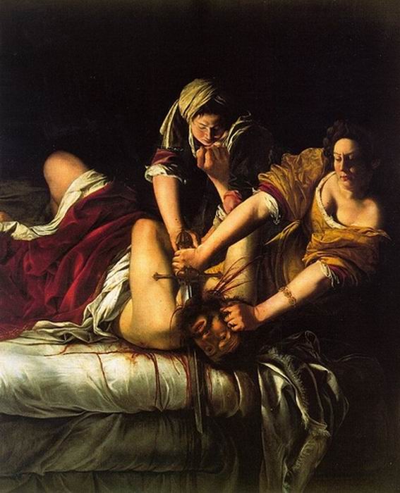
Here's Gentileschi's Judith Slaying Holofernes (1612-21). Apparently this portraitist and painter of religious scenes depticted this as many as six times. According to Dr. Robert Belton (Art, p. 248), Gentileschi was trained by her father and heavily influenced by Caravaggio. She follows his lead with strong lighting and a deep, black background.

Here's Caravaggio's from 1598, and what some critics have called a rather hesitant, squeamish Judith shrinking a bit from the task. Her maid looks rather up in years, especially compared to the stronger, younger maid in Gentileschi's version. In Art, Belton mentions an additional reason for the artist to focus on such a gory scene; as a 19 year-old Gentileschi claimed she was raped by one of the artist's in her father's workshop.


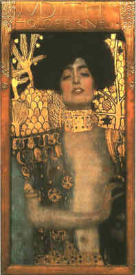
If you don't recall the Biblical story, here's a summary. In the Old Testament, the Jewish widow, Judith, saved the city of Bethulia from siege by the Assyrians by adorning herself and venturing into the enemy camp to gain access to the Assyrian general, Holofernes. He invited her to a banquet intending to seduce her, and while they were alone at the feast, Judith took advantage of Holofernes' drunkenness to decapitate him, and returned to Bethulia with his head in a sack. The Jews saw Judith as a virtuous heroine, but Klimt portrays her as a Viennese femme fatale. (from Wet Canvas)

It does seem as though you're yanked into the present day with Klimt's version. It's just arresting in its power, don't you think? You are drawn instantly to that face, but when you take a second to see those fingers, the picture has even more impact. Honestly, though, I don't think I would have looked at Klimt's as carefully if I hadn't seen Gentileschi's and Caravaggio's first. What is your reaction?

Monday, May 17, 2010


Sometimes I'm casting about for an artist to talk about and find one really close to home - my friend Christopher Harris creates his art with a pinhole camera - these are long exposure photos made with a lens-less camera. They have a moody, intriguing blurred quality that takes them away from realism toward Rothko country (that's kind of to the north of Marlboro country, minus the carcinogenics). As he explains, "His landscapes and seascapes are meditations on transcendence, a quality Americans have associated with the West for two hundred years."

His latest series will be exhibited at Lisa Harris Gallery in Seattle beginning June 3rd. They are part of his Skagit Series focussing on twilight views of abandoned boats, winter trees, and other shapes barely visible in the fading light. (You'll have to go in person; I have no images yet to post.)

Above is Canola Field. This was taken in Nez Perce County in Eastern Washington.

And here's Rodeo, taken with a small, pocket-size camera, left intentionally with this grainy, scratched look. I'm not sure why, but I seem to prefer images that require some scrutiny, that are not easy to assess with a quick glance.


I really like the movement and the spontaneity of this one. Living in the Northwest, I think gray has become my favorite color by default or osmosis.

I like the way pinhole photography magically reduces the world to its simplest elements of color and shape. I don't know enough about it to figure out how many decisions are still left for the artist. Do you know?