Wednesday, May 5, 2010


This is a self-portrait by Joan Brown, one of the second generation of Bay Area Figurative painters. I have a tattered magazine copy of this hanging near my easel; it's hard to tell here, but the eyes are very interesting - different colors.

I like her use of color, strong negative shapes, that sort of chopped off shoulder.


Why is this Green Bowl (1964) so appealing to me? Maybe it's the texture, the two shades of brown inside the bowl, the wandering edge of the bowl . . .it does seem to be a descendant of Cezanne's aesthetically, doesn't it? Has that same interest in things as objects to co
ntemplate rather than to use.


I think sometimes you can go nuts trying to search around for just the right subject, but Brown painted her family, household objects, and sometimes included symbols that held meaning for her. One more - obviously had a sense of humor. Take a look at this one called People and Eye Trees in the Park in Madrid (1961).


Sadly, she died at only 52 in an accident in India that happe
ned during the installation of one of her art pieces.

Monday, May 3, 2010


Quick - how long ago was this painted? 5 years ? 50 years? 90 years?

Well it's a John Marin from 1926 Mt. Chocorua #1.

Not many major artists of the day were working in watercolor, I don't think. (Sargent comes to mind, but he died in 1925.) After studying art in Philadelphia, in 1905 he left for Europe and stayed for six years, no doubt taking in the work of Cézanne, the Cubists, and the Fauvists.

A few important connections made a difference is his work becoming known. Stiegletz learned of him thru fellow photographer Steichen, and the former exhibited Marin's work in his studio and made introductions for him to others in the art world. Art collector Duncan Phillips was taken with his work, describing him as both an impressionist and an expressionist, "because he could capture a moment and location as well as his subjective response to it." (from Phillips Collection bio)

Marin is quoted as saying: Painting is like golf; the fewer strokes I paint, the better the picture. And that's the trick isn't it . . .which strokes?? Takes a lifetime to figure it out!


Above is Brooklyn Bridge (1912).

Here's another from this series, also 1912, that I like even better with its strong diagonals and sense of movement, a feeling for the high energy city and the structures being built.

His use of line is so good, isn't it? Doesn't seem tacked on, but absolutely right and necessary. What do you think?

Wednesday, April 28, 2010

"The world of proximate things. . .exists for Cézanne as something to be contemplated rather than used." Meyer Schapiro


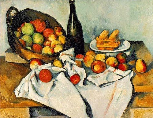
How about just a little more time spent thinking about Cézanne this morning before dismantling the still life of apples and oranges in my kitchen to make lunches? It's astonishing to me that once you have a new way of looking at things you can see so much more. Above is Still Life (1883-87).

Art historian Meyer Schapiro talks about the contemplative, detached stance that Cezanne takes and how that can be seen his approach to still life:

Cézanne's still life is distinctive through its distance from every appetite but the asthetic-contemplative. The fruit on the table, the dishes and bottles, are never chosen or set for a meal; they have nothing of the formality of a human purpose. . . .Rarely, if ever, do we find in his paintings
, as in Chardin's, the fruit peeled or cut; rarely are there choice objets d'art or instruments of a profession or hobby. The fruit in his canvases are no longer parts of nature, but though often beautiful in themselves are not yet humanized as elements of a meal or decoration of the home. (Only in his early works, under Manet's influence, does he set up still lifes with eggs, bread, a knife, and a jug of wine.) (p. 14 - 15, Cézanne, Meyer Schapiro)

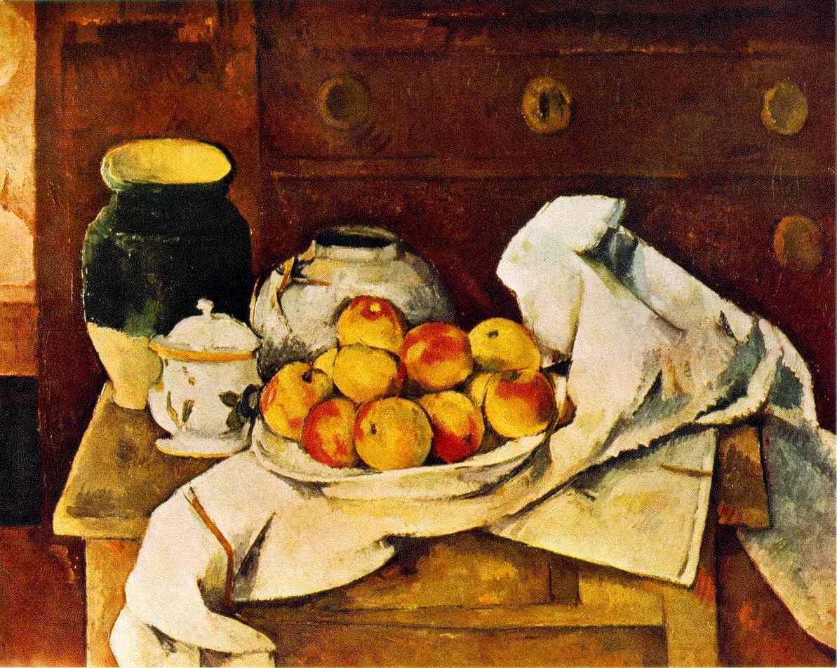
Here's Still Life with Apples (1895-8). He's right, don't you think? These are objects to arrange, explore, depict in color to create volume, and so on, not to eat
for lunch.

Not at all what Chardin was up to - here's Still Life with Plums (1730).


What's fascinating to me is that Cézanne's contemplative, aesthetic approach to the world of objects extends to his portraits as well. Here's Card Players (1890-2). Off to the kitchen to cut up that real fruit. Please tell me what you think. . . .


Monday, April 26, 2010

Came across an excellent book by art historian Meyer Schapiro. (By the way, his NY Times obit is worth reading.) Does it matter that his take on Cézanne was published more than 40 years ago? I don't think so:

"The objective world isn't just represented - it is recreated through strokes of color. The world he creates is colorful, varied and harmonious. . . it is a creation of the mind of the painter who is making us aware of a decision of the mind and operation of the hand. In this complex process. . . like the effort of a philosopher to grasp both the external and the subjective in our experience of things, the self is always present, poised between sensing and knowing, or between its perceptions and a practical ordering activity, mastering its inner world by mastering something beyond itself. (Cézanne, Meyer Schapiro, Abrams, 1965)

Okay, this is starting to explain things for me. This "practical ordering activity" of Cézanne's has him deciding to tilt tabletops and fragmented solid forms. Schapiro explains further:

To accomplish this fusion of nature and self, Cézanne had to create a new method of painting. . . He loosened the perspective system of traditional art and gave to the space of the image the aspect of a world created free-hand and put together piecemeal from successive perceptions, rather than offered complete to the eye in one coordinating glance as in the ready-made geometrical perspective of Renaissance art. The tilting of vertical objects, the discontinuities . . .contribute to the effect of a perpetual searching and balancing of forms. (p. 10)

Reading Schapiro, it's clear that Cézanne did not sit in his studio and cook up a new approach to painting and then set out to make masterpieces in this style. He searched, and experimented, and looked to try different ways of composing what was in front of him, different ways of ordering the world, "an order arising from mastery over chaotic impulses. . . "

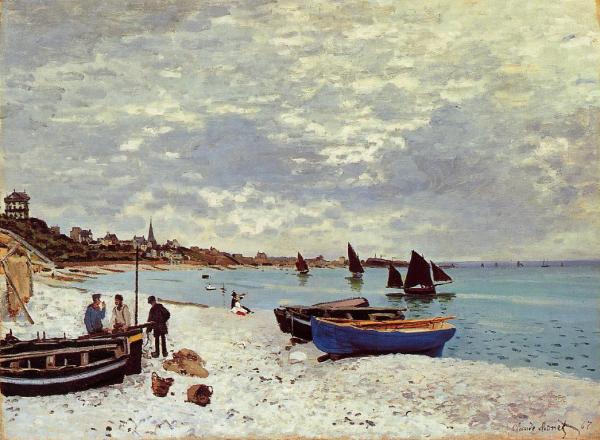
It gets easier to see what Schapiro was talking about once he compares Cézanne's work to Monet's.

In Monet's The Beach at Sainte-Adress, the painting is divided into large areas of land and sea, and the colors in Monet's share a similar value and intensity. There is an airy feeling about Monet's and a gray tone unites it.

Below is Cézanne's Bay from L'Estaque. Schapiro points out that the division between the land and sea receives greater emphasis, the contrasts are heightened through the use of such strong colors, and the treatment of shapes is different.

The triangles of sea and land are more strongly connected as shapes that interlock. There is a weight to the sea. Monet's inclusion of small things which attract the eye and interrupt the large forms give the sense of a passing moment, where Cézanne's approach is to emphasize "the grandeur of the scene."


Seeing these side by side, what Schapiro is saying makes sense to me: there is drama, solidity, and weight in Cézanne. Not what Monet was after at all. What do you think? Does this make sense?

Friday, April 23, 2010


Weird coincidence - my book is open to a page with André Derain and I'm ready to write something about his work and the encouragement he received from his dealer, Ambroise Vollard. But in my scattered Friday morning mindset I decide to check email first, and there is a link sent by my friend Beth. And it's about the works of Derain and others that will be auctioned by Sotheby's. Many have not been seen in decades. Click here for the complete article from ArtDaily.org. Here's an excerpt:

The extraordinary trove of treasures was discovered in 1979 in a bank vault at the Société Générale in Paris. The works had been deposited there during 1939, soon after Vollard’s death, by Erich Slomovic, a young Yugoslav and associate to Vollard to whom the dealer had consigned the works. Soon after depositing the works, Slomovic fled to Yugoslavia where he died at the hands of the Nazis at the end of 1942. As a result, the contents of the vault remained untouched for 40 years. On 21st March 1979, the bank was permitted under French law to open the vault and to sell any contents of value in order to recoup some 40 years of unpaid storage fees. As a result, the collection was consigned for a sale to be held at Hotel Drouot in Paris in March 1981. The announcement of the sale, however, was swiftly followed by legal challenges as a result of which the sale was cancelled. Those challenges now finally resolved, the works will now be sold by agreement among the legal beneficiaries of the Vollard Estate and will finally make their long-anticipated appearance on the market at Sotheby’s sales in London and in Paris in June.

Here is La Tamise et Tower Bridge (1906), with the kind of intense colors Derain and fellow student Maurice de Vlaminck experimented with. Dealer Vollard suggested Derain go to England to see what this approach might yield in those environs.

Lately I've been spending more time thinking about those 4 corners and how to play them - he's got interesting stuff going on in all of them, doesn't he?

Your eye
just moves from one place to another - And who would try those two red boats to the left of the Tower Bridge? But they work as one unit, anchoring the space, I think. Looking at the water where those two boats touch the surface, he's chosen more moderate tones of soft blue and ochre; they seem really important to calming down the effect, don't you think? Otherwise the painting would just be screaming at you.

Get your paddles ready. Here's one from the long-hidden cache, Arbres a Collioure (1905), ready for auction:


Wednesday, April 21, 2010


Who was Fateh al-Moudarres? A diplomat? Pulitzer-prize winning author? I think it's kind of awful that I can name dozens of American artists but would be hard pressed to name artists from any Middle Eastern countries. Somehow I feel sure that educated people in the Middle East could easily name artists both here and there.

Above is the oil painting Wedding in the Kalamoon Mountains, (1977) one of his most well known works. He was also a sculptor, poet and novelist, studied in Rome and Paris, taught in Damascus where he influenced many Syrian arti
sts, and died in 1999.

Below are two untitled gouaches on wooden board (1966) by al-Moudarres, a Syrian artist:

A lot of his work was inspired by icons, ancient symbols and traditions. I don't know about you, but I like the scratched surface, with those the colors from the underpainting coming through. Evidently, he rarely used writing in his work, but in this piece appear the first words from the Qur'an Chapter 108 - "Surely we have given thee abundance."


Having experimented with combining any kind of figuration with abstraction, I know how hard it is to integrate the two successfully. One element often winds up looking tacked on or just not inevitable and necessary. These just seem right to me. What do you think?

(For the British Museum's brief bio, see this link.)

Monday, April 19, 2010

Came across an interesting interview with Luc Tuymans, the Belgian painter, in the February issue of Art in America.

I think it's always tricky to try to have your paintings carry any kind of political or cultural meaning, but in my humble opinion, he succeeds where so many others either state the obvious or go for something gimmicky.


He has a retrospective on right now at the San Francisco Museum of Modern Art; the show will travel to Dallas, Chicago, and Brussels.

After exploring WWII themes that grew out of his exploration of family members' involvement on opposite sides of the war, he turned his atten
tion to a wide range of subjects, including governments and power, violence, cultural influences. Above is Secretary of State.
While the title of this painting is just what it describes, he chose her image as part of a larger show called "Proper" about various aspects of the Bush administrations, its people and its policies, going at them indirectly.

"Like Colin Powell, Rice had adapted to racism in order to succeed. She had learned to be composed, determined, proper."


Also included in the retrospective are "two distinct but surprisingly related bodies of work, one about the Jesuits ("Les Revenants" 2007) and the other about Walt Disney's dreams ("Forever" 2008). Tuymans says:

I didn't come from the right social layer, but in Belgium the power structure has deep roots in the Jesuit system. And whatever one may think abo
ut them, they've been important for image-building in the West - just think of Rubens and the Baroque. Both the Jesuits and Walt Disney were involved with crazy utopian schemes based on taking fantasies and turning them into entertainment. But the consequence of instrumentalizing fantasy is that you delete its content, everything that makes it exciting.

I'm not sure that I'm following every thread here, but, he goes on to explain that his assistant came upon some old pictures on the Web that showed the opening day of Disneyland. Tuymans was interested in using photos that revealed all that was not utopian, sentimental, and sunny, so he worked with images of the things that went wrong, including a gas leak in the Alice and Wonderland ride and a problem with a collapsing tu
rtle float in the Light Parade. He painted both. Here's the float painting, called Turtle:


As you can see, he leaves a lot of room for the viewer to see what he/she wants to see. "I have to degrade the image, to make holes in it, 'leap holes' you might say, because what stimulates me most in an image is inconsistency." (p. 81)

I like this open-ended approach to image creation. One critic admitted he always sees a wedding couple when he looks at Turtle. I have to think that would be just fine with Tuymans. What do you think?

(By the way, this link will connect you to an article about Tuymans.)