Wednesday, September 30, 2009

"Exactitude is not truth." Matisse

I am just figuring out that sometimes a subject can be so captivating in all its details that it becomes a stumbling block to the making of an interesting painting.

In reading about his time in Morocco, it's clear that Matisse had no interest in producing a series of picturesque, ready-made scenes that might sell well back home in France. Twenty years after going he wrote, "It will probably surprise you if I tell you that I have made plans to spend several months in Paris considering that for the moment I need to concentrate and that travel, the change of climate and the excitement of new experiences, of which the picturesque is the most affecting, would lead me into too great a diversification. . ." (from Matisse, by Gilles Neret, p. 75)

It was only after he forgot all the little details th
at he could "remember the striking and poetic side," that drew him to the scene in the first place. "Hitherto I had been pursued by the love of accuracy which most people take for truth."

Above is the Arab Cafe, (image from Chess Theory) s
tripped down marvelously to shapes and lines (and those goldfish.)

Here's Zorah on the Terrace - again those fish. . .(I don't know what they signify; do you know? ).


So how do you find the essence of the image you
want to paint? Lots of thinking? Less thinking, more instinctive response? Sketching? Plunging in? What about starting with nothing? I can't do it. Have to have some scraps of photos, bits and pieces of sketches, or some object in front of me.

Matisse says "If there were no model I would have nothing from which to deviate."

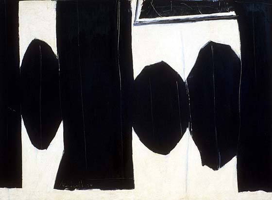
Here's a quick study for one I might call City People. Do you think it needs some fish?


Monday, September 28, 2009

I have been half in love with easeful death. . Keats

So long as you write what you wish to write, that is all that matters; and whether it matters for ages or only for hours, nobody can say. But to sacrifice a hair of the head of your vision, a shade of its colour, in deference to some Headmaster with a silver pot in his hand or to some professor with a measuring-rod up his sleeve, is the most abject treachery, and the sacrifice or wealth and chastity, which used to be said to be the greatest of human disasters, a mere flea-bite in comparison. Virginia Woolf

Went to see Bright Star, the new movie about John Keats. Really struck by how little critical praise or financial profit he received during his short life - he did not even have enough money to get to Italy that last year in order to convalesce and avoid another cold English winter - his friends had to come up with the money. If he had known about the book, "Do What You Love and the Money Will Follow," he certainly would have figured the money was following at a safe distance.

I remember hearing that orange is the least popular color in a painting while blue is at the top of the list. If Keats had been a painter, he would have just continued with puce if that had been his passion. But it is hard to not ever listen to a quiet voice saying, well, maybe just a nice blue painting to see if it sells quickly.

Here's Vuillard's Two Women at the Linen Closet. How does he get so much with so little out of those faces?

This is my only orange painting, Noon, inspired from a photo I took in Rome, not far from where Keats died in 1821 at the age of 25. Ready to sell to a color-blind individual.


Thursday, September 24, 2009

Pink is hard, at least for me it is. Can easily go toward sickly or Barbie. How does Gauguin make it work?

Riders on the Beach
was painted in 1902.

Besides the pink struggle, there are always the composition problems. Sometimes, when trying to decide on the balance of shapes in a compositio
n I'll put my hand a few inches from my face to block a figure and see if it seems necessary to a painting. In Riders, those 7 are absolutely necessary,don't you think? Also vital are those trees in the far left, providing some vertical opposition to all that horizontal movement. He just knows when to stop, too. There's a lot to draw your eye but areas for it to rest, as well. How he comes up with a painting filled with motion that seems so serene amazes me. Also, I find the figure on the left (with no horse) intriguing in that he seems to be not completely planted on the ground, but somehow pinned in place by some magical means, some tension created by his position relative to the other figures. Does this make any sense?

Here's a shot at using pink - a diptych of a ship at the dock in Bellingham with Lummi Island in the background. I lost the nerve to go strong and faded out the pink; the sky was very rosy when I took the pictu
re. Maybe needs some punching up.


Monday, September 21, 2009

"I'm very attached to subject matter and this determines to a large extent what happens in my paintings.. " Theophilus Brown

With a great name like that, I guess I shouldn't have been surprised to read that he is a descendant of intellectuals whose friends included Emerson and Thoreau. I don't know why he does not seem to have the name recognition of his contemporaries (Rothko, deKooning, Diebenkorn, Park, for instance.)

While some of the painters he worked and studied with (Bay Area Figurative Artists) depersonalized their subjects, rendering faces in a more universal and less particular way, some of Brown's subjects are quite obviously distinct people. Here's a favorite of mine with its blazing blue eyes, entitled Portrait of D.K. (Don Knutson), 1964. I find it hard to use both red and blue without having them fight with each other or cancel each other out; these two hues he's chosen seem to enliven the other. In the book I have, the red in the upper left is saturated and glowing. Hard to see that here.

He also dashed off (well maybe they are not spontaneous but they look it) these small black and white portraits of Jack Kerouac and Allen Ginsburg.

Doesn't it seem like it may take more ability to know what to leave out as it does to nail down the features? Love those two lines on Ginsburg's forehead. (I'm starting to sound like Oprah - "love that!") The
se were both painted in 1961 on
paper with oil and casein.


Hard not to look at these without just giving up and putting away your sketch book forever.

I was inspired to learn that Brown is 90 and still paints in San Francisco; his new work can be seen at Elins Eagle-Smith Gallery.


Thursday, September 17, 2009

Recently stumbled upon the work of Grace Hartigan, a contemporary of Pollock, deKooning, Rothko, and Kline. (And I found her without the help of stumbleupon.com no less.) I think sometimes I worry too much about borrowing ideas from another artist's work, especially considering how often artists of the past incorporated and responded to the work of their predecessors.

Here's the incredibly colorful and energetic River Bathers that Hartigan painted in 1953:


And here's Matisse's Bathers by a River (1906):

And here's what Pierre Schnei
der has to say in Robert Mattison's book about these in Grace Hartigan, a painter's world:

Matisse's painting symbolizes a "vanishing paradise" where "cold, gray figures are trapped by a ruthless pictorial geometry." He goes on to say, "Matisse realized that the concept of idealized nudity in a perfected world - which had been port
rayed from Greek classical art . . .and in Matisse's early canvases - was a modern improbability." Now I don't know if this is really what he was thinking about, but it is clear that Hartigan is painting her iteration of the scene.

You have to look kind of intently to even notice her four figures, so closely are the enmeshed in the vertical areas of color and slashing brushstrokes. Some have suggested that her figures are awkward and uncomfortable with their nudity. I don't know. What I like is that you cannot take in the whole painting at a glance. You just want to go back and back to it, seeing more there each time, enjoying the strong orange/red in the right corner against its pea-green complement, and marveling at the energy coming from all those blues and whites. Too bad it's at MOMA in New York and not nearby.

Tuesday, September 15, 2009

"It may be that the deep necessity of art is the examination of self-deception." Robert Motherwell

I don't really know why I like looking at Motherwell's Elegy series so much. I was interested to learn that the first one was just a small drawing on paper - he called it Ink Sketch, Elegy No. 1 - and it was simply an illustration to accompany a poem by Harold Rosenburg. The poem and sketch were printed in the revue Possibilities and due to printing cost concerns, the artist chose a simple black and white color scheme.

Motherwell was a philosopher and according to Jack Flam in Motherwell, he was familiar with the Symbolist notion of "illustrating" a poem without directly illustrating any of the images that appear in the poem, a notion that had its basis in the Symbolist principal of "correspondance."

When asked about it, he explained: "It has literally nothing to do with the poem - except perhaps for their both having brutal qualities - certainly not its images. Certain critics have read the phrase 'wire in the neck' as being described by the lines between the ovals. No wire or neck is there."

According to Motherwell, a year later he came across the image and decided to rework it. At the time he was reading Lorca's poetry and had the refrain "five in the afternoon" running through his mind.

"When I painted the larger version - At Five in the Afternoon - it was as if I discovered it (the image) was a temple. . . and when I recognized this, I looked around for whom represented what the temple should be consecrated to, and that was represented in the work of Lorca. . .to be more concise, the 'temple' was consecrated to a Spanish sense of death, which I got most of from Lorca, but from other sources as well - my Mexican wife, bullfights, travel in Mexico, documentary photographs of the Mexican revolution, Goya, Santos, dark Hispanic interiors."

With no such influences in my Washington existence (Elegy to a Girls' Soccer Game?) to influence grand ideas, I sometimes struggle to come up with a title that works. Although this is taken from a Washington image, Wallace Stevens' Idea of Order at Key West crept into this one, called Ghostlier Demarcations.


Saturday, September 12, 2009


Came across this painting by Vuillard -- love the eyebrows on the dealer in the foreground. He is one of the brothers who owned the Bernheim-Jeune Gallery in Paris where Vuillard's work was exhibited. They became his friends, but it does seem that he can make a little fun of them here, showing the one in the background fussing over the books while the one in the foreground is almost a caricature of a sly salesman.

Love the shapes of those lights used to show off the paintings and the posture of the salesman, ready to spring to his feet and come forward. The pointy foot is great, isn't it?

In Vuillard, author Stuart Preston explains that Vuillard hated the financial side of the art world and became increasingly uncomfortable as he watched the prices for his works rise toward this end of his life. This one was painted later in his life when he began to simplify his interiors.

Here's an earlier one I like. Shows the interior of Madame Vuillard's workroom where Vuillard's sister Marie sorts materials and his friend, the painter Ker-Xavier Roussel, peeks around the screen at Marie, whom he would marry the same year this was painted. Vuillard had training in the theater and you can certainly see that in the whole set-up of this scene. That big orange shape in the corner, a wardrobe closet or something, seems to anchor the scene somehow. This painting, entitled Interior.

And one more, below, that goes in the other direction. No decorative patterns, very simple shapes, flatness influenced by his interest in Japanese prints, an intruging corner of a jack in the upper left. It's called Ker-Xavier Roussel Reading a Newspaper. (By this time he was married to Marie.)
I suppose if Vuillard were working today there might be a Kindle in this picture.

Wednesday, September 9, 2009

"Atmosphere is my style." J.M.W. Turner

Reading lately about the criticism that dogged and discouraged Turner throughout his career for the "rough handling of his paints" as he pushed his images more and more toward abstraction.

When he painted this, Turner was 67 and prone to some confusion with names and locations, often mistaking one locale for another. Here's th
e rather wordy title: Snow Storm - Steam Boat off a Harbour's Mouth Making Signals in Shallow Water, and Going by the Lead. The title actually continues on: The Author was in this Storm on the Night the Ariel Left Harwich.

It's seems that this info has kept historians busy trying to determine exactly which boats were at sea during which storm, and so forth. Does it m
atter? I'm more struck by how determined Turner was to experience the storm firsthand. His friend and defender Ruskin claims Turner told a gallery visitor of his own Odysseus experience. Turner sounds like he's a little tired of trying to please the critics:

I did not paint it to be understood, but I wished to show what such a scene was like; I got the sailors to lash me to the mast to observe it; I was lashed for four hours, and I did not expect to escape, but I felt bound to record it if I did. But no one had any business to like the picture.
(from J.M.W. Turner, edited by Ian Warrell)

Today this would be called a performance piece, I suppose, and set the artist up for all sorts of grants and awards. How important is it for you to be really close to your subjects? Do you usually work indoors from photos or try to get outside, at least to begin the painting? Do you think it matters what approach you use?

A painter whose work I like is William Wray; he reminds me of Turner in his ability to use a limited palette, strong shapes, and a few lines to create a mood. Here's Near Burbank Airport.


Monday, September 7, 2009

"I don't believe that the artist has to wait until the muses come. I believe that the muses live within you and all you have to do is paint." Tamayo

In Twyla Tharp's book, The Creative Habit, she talks about how she has organized her time and concentrated her energies in order to do her creative work:

"I eliminated every distraction, sacrificed almost everything that gave me pleasure, placed myself in a single-minded isolation chamber, and structured my life so that everything was not only feeding the work but subordinated to it. It's not a particularly sociable way to operate. It's actively anti-social. On the other hand, it is pro-creative."

Sounds a little extreme to me. Of course, the single-minded, obsessed artist is a centuries-old archetype. Rufino Tamayo had the same intense focus. He was a Zapotecan Indian painter which is kind of fun to say.
(For image, see this.) In an interview years ago for ArtNews, he described his incredible work schedule. He lived into his 90s, and even at 79 at the time of the interview, he put in long hours. Tamayo said he usually worked steadily for 8 hours a day, listening to Bach or Mozart while he painted, stopping briefly for lunch, and then continuing "until the light fades." His wife wasn't so excited about this: "The only thing he loves is working. I do everything for him. . . And what does he do? He only works and never opens his mouth. I live with a mute!"

What is the goal, then? If you don't take an extreme approach to your art are you doomed to being a dabbler, a dilettante? Can you snap your fingers and get something done quickly or is time the main ingredient that can't be worked around? Are there any shortcuts to making the time you do have more productive? I don't know. I'd love to hear some ideas.

I like Agnes De Mille's words about guessing and trying: " Living is a form of not being sure. Not knowing what next or how. The moment you know how, you begin to die a little. The artist never entirely knows. We guess. We may be wrong, but we make leap after leap in the dark."


Friday, September 4, 2009

"A drawing is simply a line going out for a walk." Paul Klee

Looking at this, I think you might never guess that it's a watercolor by Paul Klee, painted when he was about 30. It's called The Artist in the Window - you can feel how much he's concentrating, completely absorbed in his work. I too am rather hunched over as I work, but never with this much power. According to Don Hall, author of Klee, the artist has digested and re-interpreted the work of Matisse and others of the French school by "greatly exaggerating the distortions they employed."

As Hall explains it, this painting came early, long before Klee h
ad become the respected teacher and accomplished painter we are familiar with.

Looking through images over the years to follow, it's amazing to see how his style evolved as he combined line and planes of color in inventive ways, reflecting his belief that "everything that happens in a picture must have its logical justification."

There's a very beautiful painting by Klee, Fire in th
e Evening. The title of this work from his Egyptian series ties it to nature, even though it appears that he's just as interested in the subdivisions of space with vertical and horizontal lines as he his with depicting the red sun drawing the eye as evening colors fade to grays.


Finally, toward the end of his life you come to R
ed Waistcoat, painted nearly 30 years later than the self-portrait above, when Klee was suffering from schlerodema. According to Hall, Klee is "breaking down the former flowing line and rhythmic repetitions into separate units" and, rather than locating images in space, he's using fragments of broken line to suggest relationships and create energy.

Hall says the breaks in the line relea
se energy, kind of like a door that's ajar. That makes sense to me. What do you think?

Wednesday, September 2, 2009

"I am only beginning to understand. I should start all over again." Pierre Bonnard

Trying to finish a batch of paintings this month. Wondering if a painting is ever finished.

At left is Bonnard's, The Table, (image from DevilandEgg.blogspot.) Why do I like that front table edge so much? I love the tilting-forward out of whack perspective and the strength of all that white on the tablecloth. Like so many of his, the figure seems incidental, like just one more object in the room. Each object is just beautiful to look at on its own as well as in its relationship to the other shapes and colors.

Apparently, even Bonnard couldn't leave well enough alone. According to Julian Bell in Bonnard, the artist would take his friend Vuillard with him to museums where Bonnard's paintings were hanging. Vuillard would distract the guard for a few moments while Bonnard would sneak over, take out a hidden paintbox, and fix something that had been bothering him.

Are you disciplined about not over-working a painting? Do these corrections usually work or do you sometimes make things worse? I don't always follow my own advice, but it helps sometimes to think about the change I might want to make for an extra day or two.

We are taking a few vacation days so I won't be able to make unnecessary fussy changes for a short while!